Navigating and Filtering Standard Dashboards
Follow these quick steps to open standard dashboards, apply filters, and analyze live KPIs in CURQ 18:
1. Open a Standard Dashboard
Open the Dashboards app from the main menu.
In the left sidebar or top menu, click on the dashboard you want to view (such as Sales, Invoicing, or Warehouse Metrics).
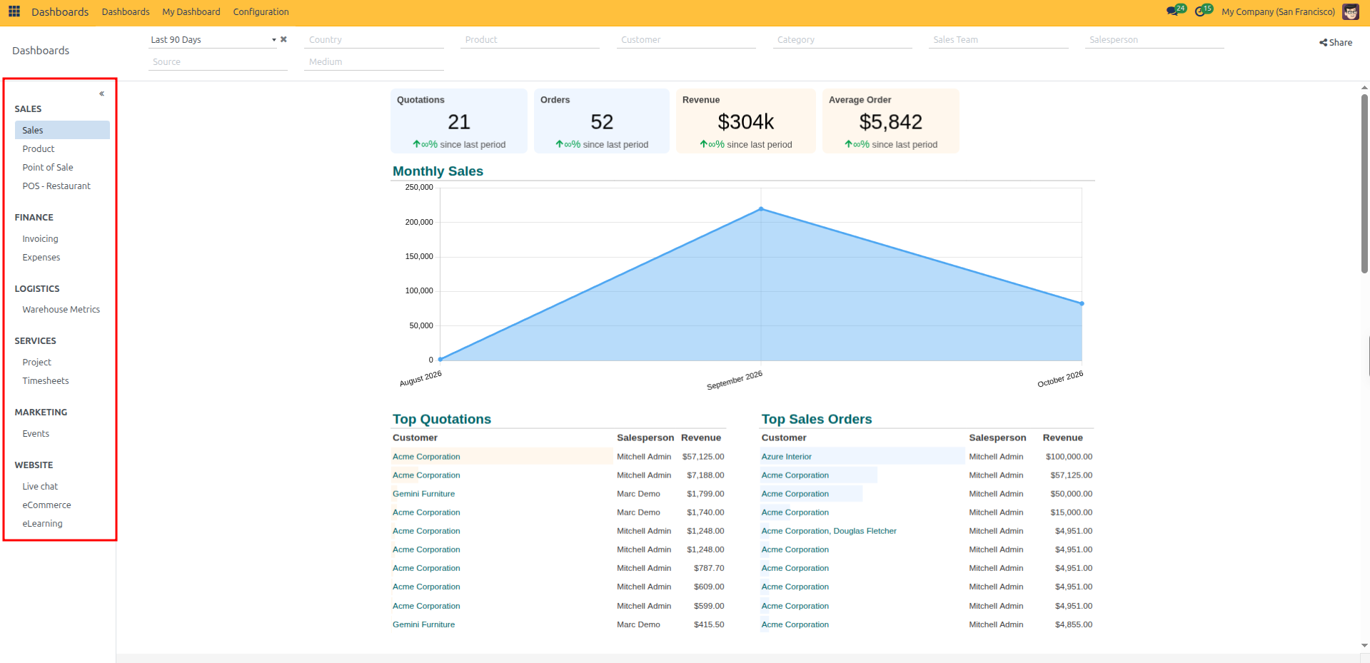
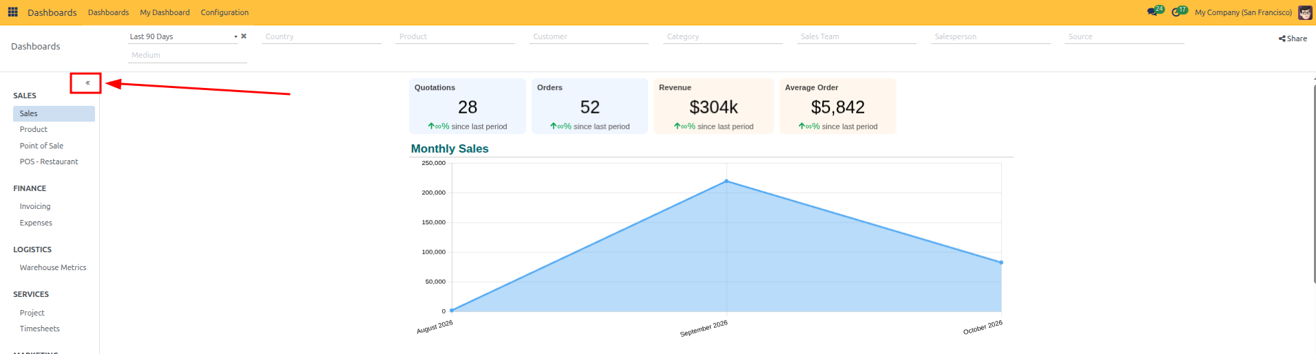
Collapse the sidebar: Click the collapse double arrow (
«) icon next to the sidebar heading to maximize your dashboard workspace.
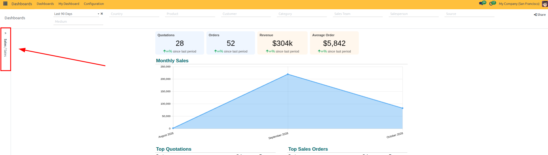
Expand the sidebar: Click the collapsed sidebar tab (
») on the far left to reopen the dashboard navigation list.
2. Read KPI Cards and Charts
Each dashboard organizes data through distinct KPI cards and chart types designed for specific analytical purposes:
KPI Card Types
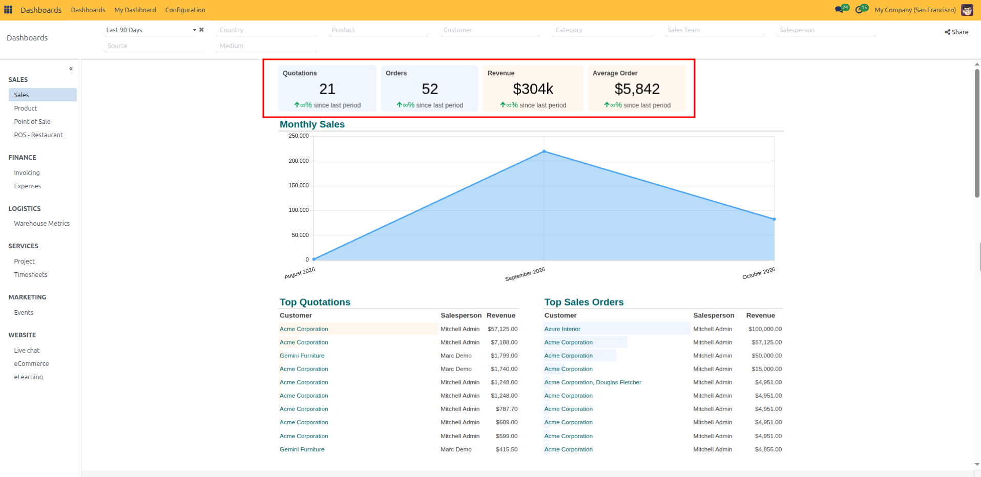
Summary & Benchmark KPIs: Prominent cards (such as Quotations, Orders, Revenue, and Average Order) provide an instant 3-second operational health check with percentage growth indicators against the previous period. Clicking any card drills down into that metric’s source records.
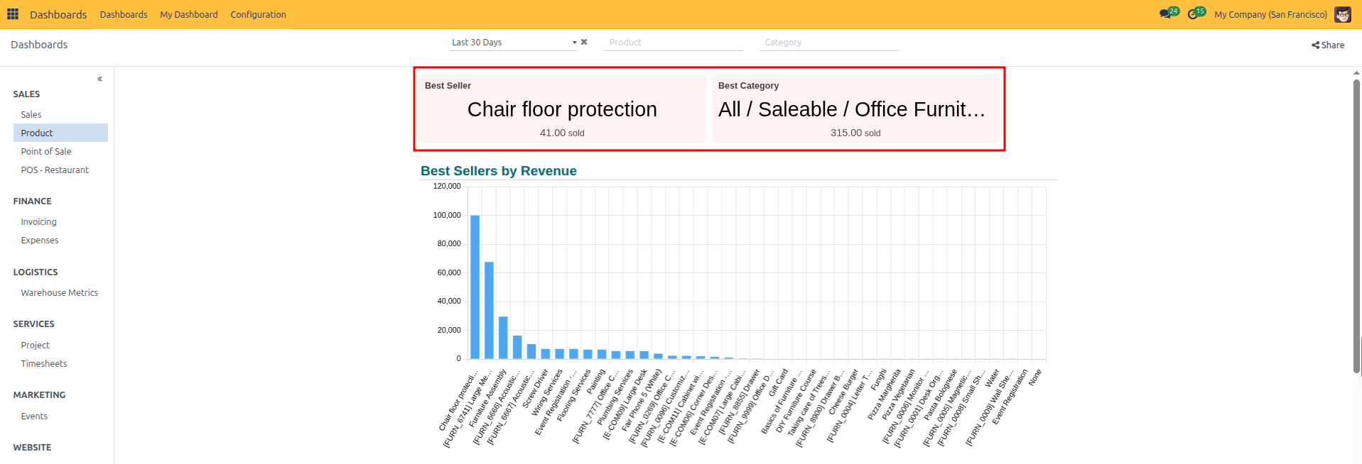
Top Performer KPIs: Highlight leading items or business segments (such as Best Seller product and Best Category) along with their total units sold.
Gauge & Rating KPIs: A visual speedometer gauge displaying satisfaction scores or qualitative performance benchmarks (such as Average Rating out of 5 stars).
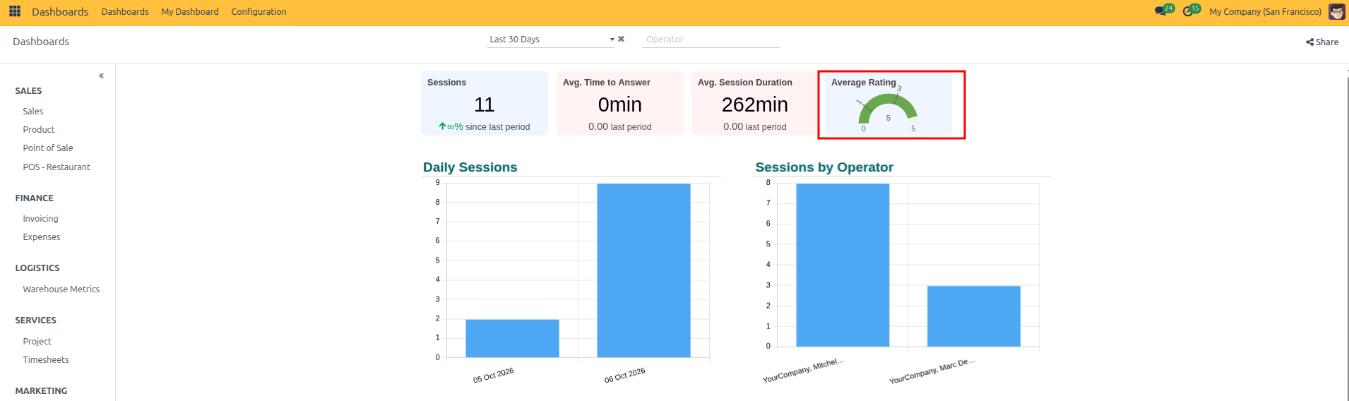
Chart and Graph Types
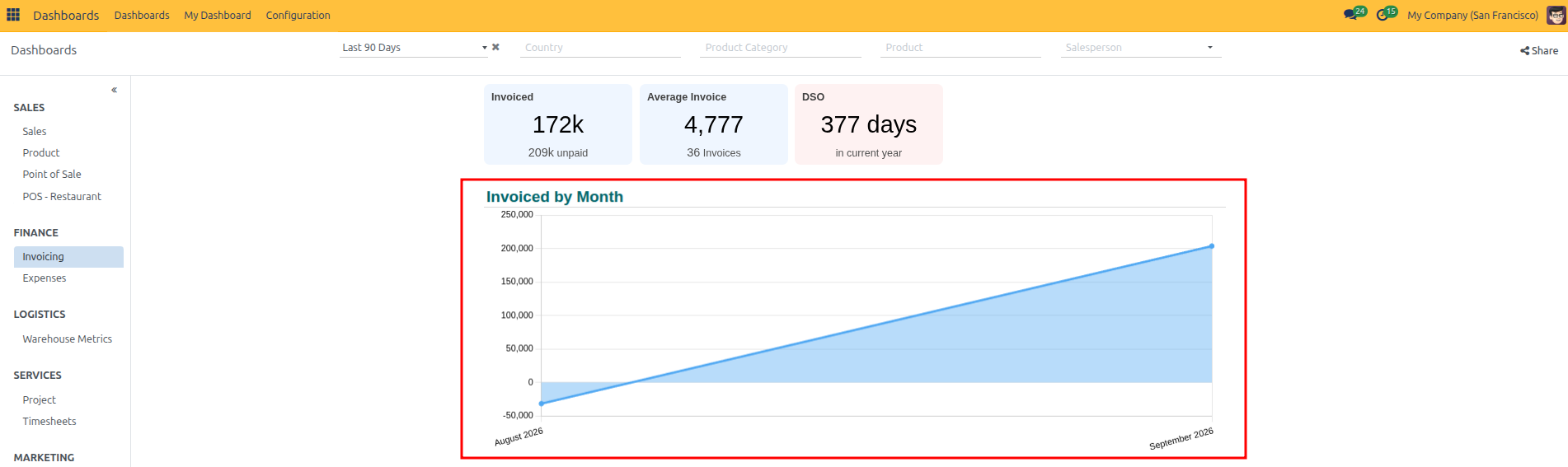
Line and Area Charts (Trends Over Time): Plotted timelines track growth trajectories, peaks, and seasonal slowdowns across months or weeks (such as Invoiced by Month or Orders by Month).
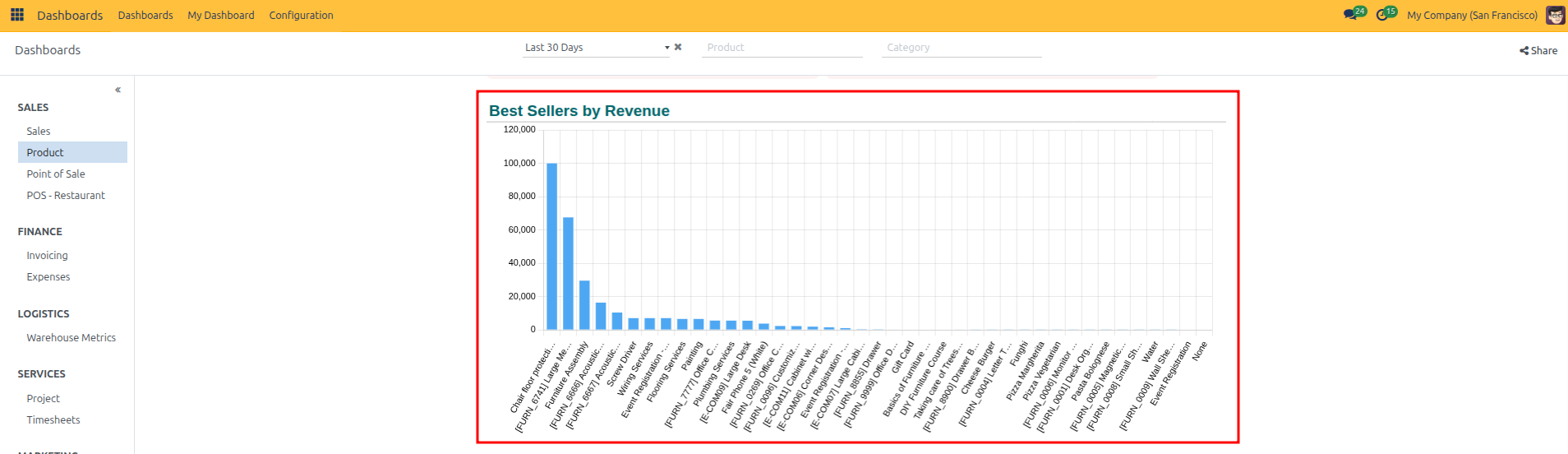
Bar Charts (Category Ranking): Compare figures across items, products, or salespeople side by side to rank top performers (such as Best Sellers by Revenue).
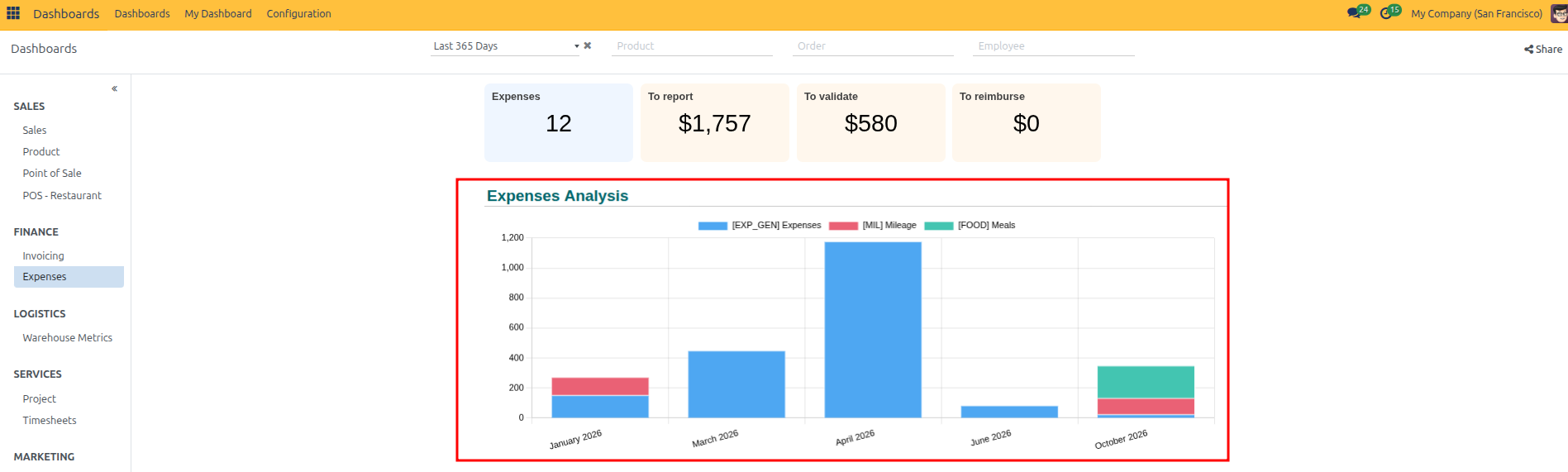
Stacked Bar Charts (Multi-Segment Breakdown): Break down monthly totals into individual cost or activity components (such as Expenses Analysis broken down into General Expenses, Mileage, and Meals).
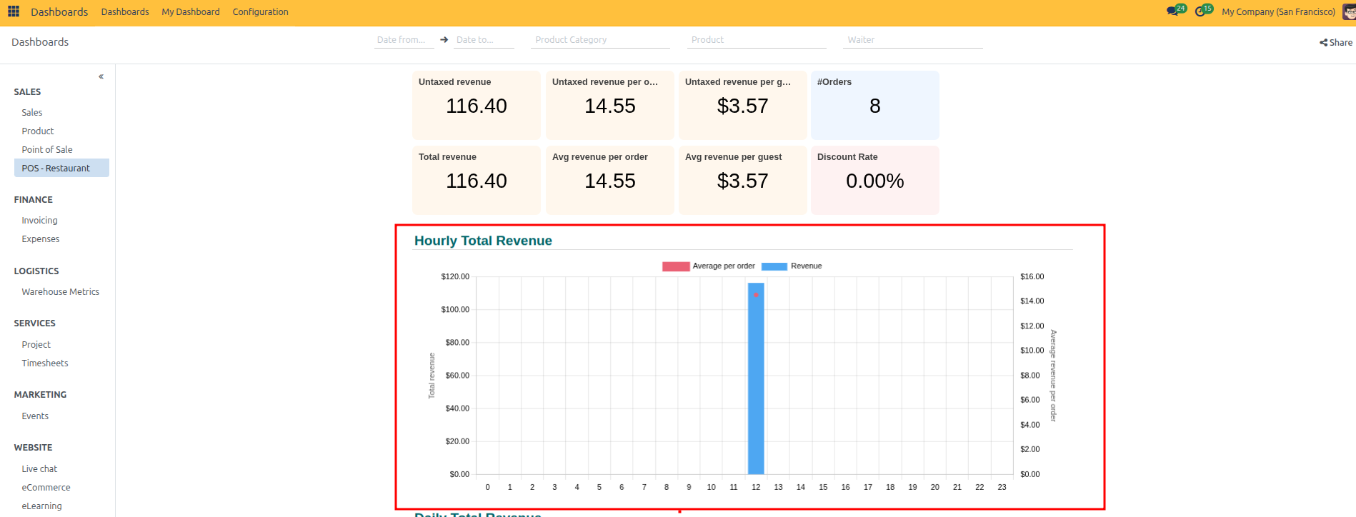
Combo Charts (Dual Metrics): Plot two complementary measures on the same chart using bars and lines (such as Hourly Total Revenue comparing total revenue bars with average revenue per order line across hours of the day).
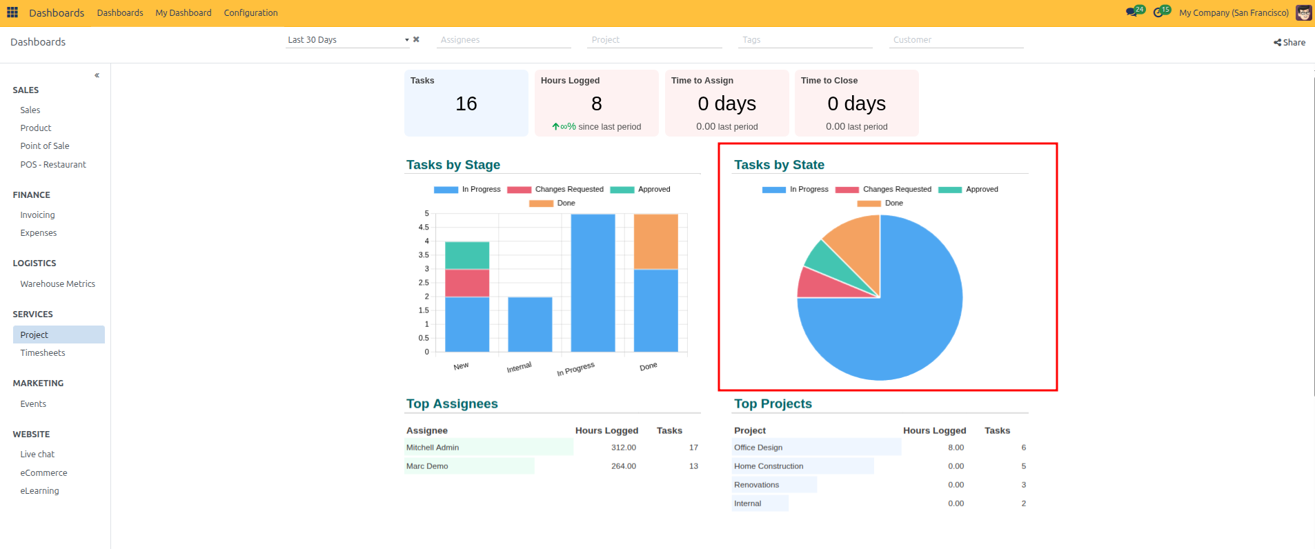
Pie Charts (Proportional Share): Display how a 100% total splits across different operational categories or states (such as Tasks by State divided into In Progress, Changes Requested, Approved, and Done).
3. Filter Dashboard Data
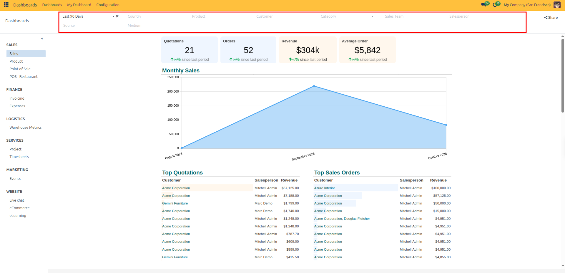
Use the filter bar across the top of the dashboard to narrow down your data:
Date Range: Click the timeframe dropdown (such as Last 90 Days) to choose a period, or click the
xicon to clear it.Dimensions: Filter by Country, Product, Customer, Category, Sales Team, or Salesperson.
Marketing Source: (Optional) Filter by campaign Source and Medium.
Share: Click the Share button at the top right to share the filtered dashboard link with team members.
4. Drill Down into Records
Click on any metric card or chart section to view the underlying records:
Click directly on a KPI card (for example, Quotations).
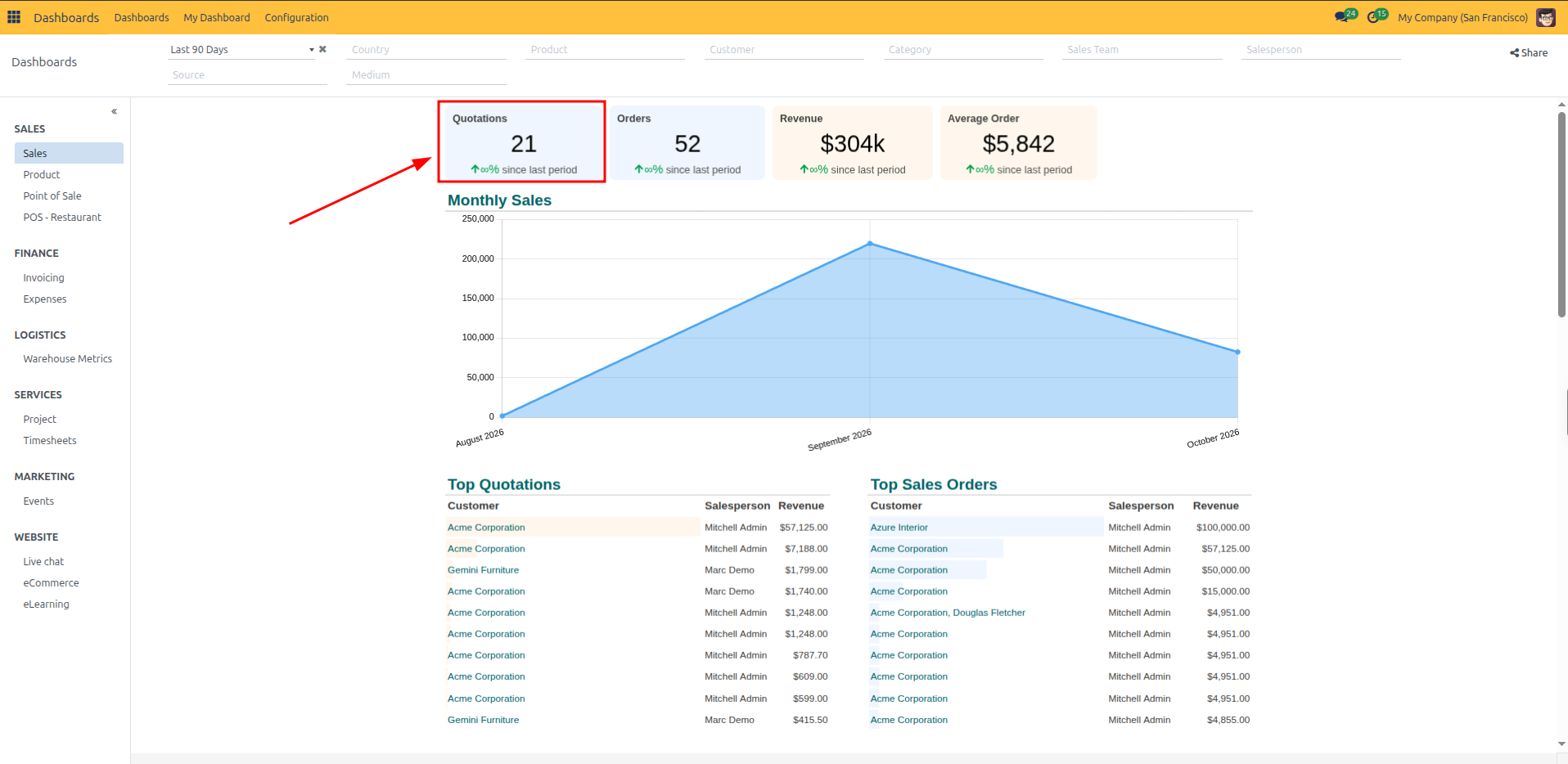
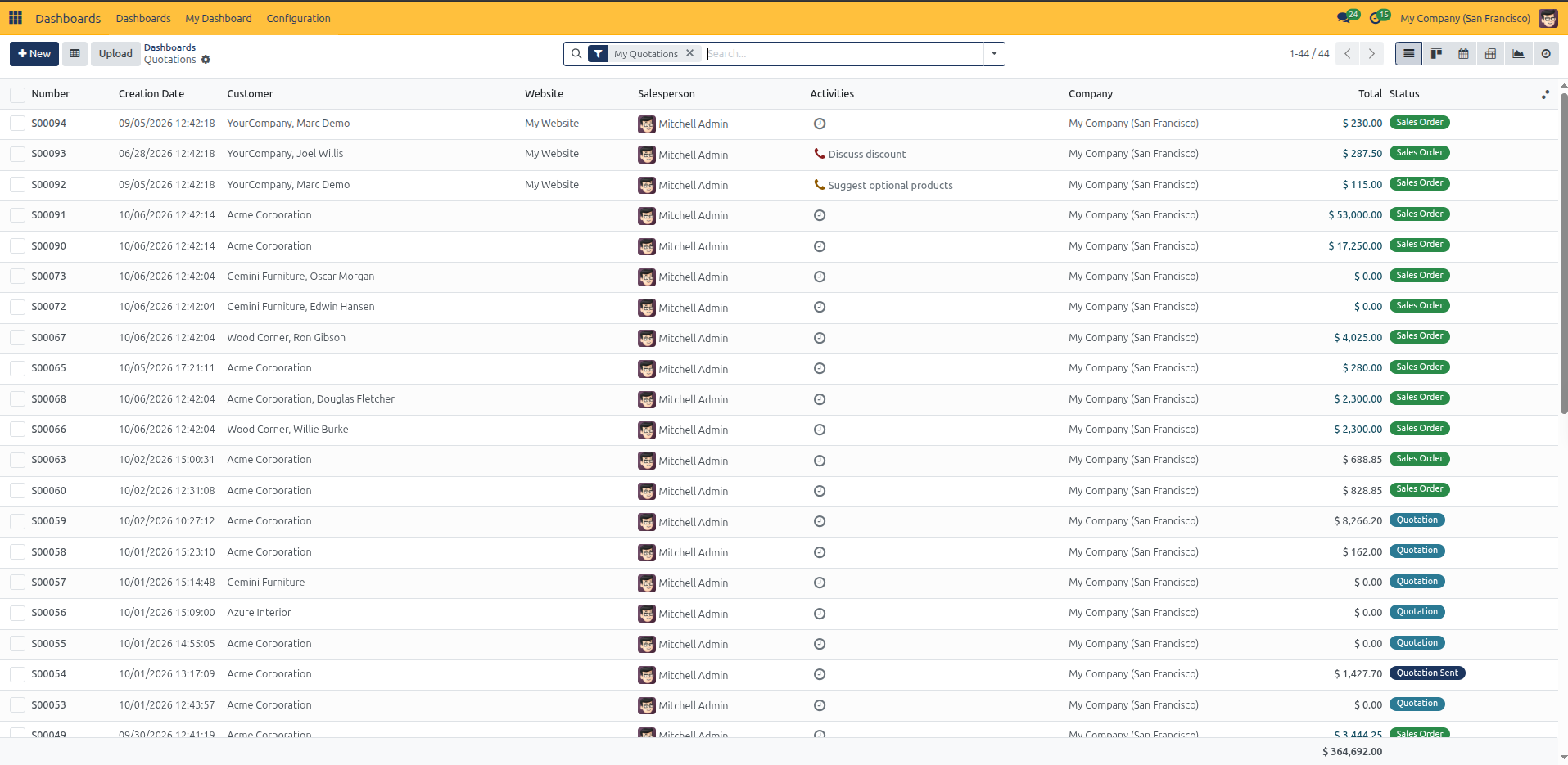
CURQ opens the list of matching records with the dashboard filters pre-applied.
Click the breadcrumbs (such as Dashboards) at the top left to return to your dashboard.