Dashboard Groups Configuration
Create and organize dashboard groups, define sidebar category hierarchy, adjust display sequences, and manage group spreadsheets and permissions in CURQ 18.
1. Overview of Dashboard Groups
Dashboard groups serve as top-level category containers in the left navigation sidebar of the Dashboards app (such as Sales, Finance, Logistics, and Services).
Organizing dashboards into structured groups allows administrators to:
Keep business metrics neatly categorized by department or functional domain.
Control the vertical display sequence of categories in the sidebar using drag-and-drop handles.
Directly attach and manage spreadsheets, security access groups, and publishing status within each group.
[!NOTE] Required Modules: To use all dashboard features in CURQ 18, you need 3 types of modules installed:
spreadsheet_dashboard: The core module for Standard Dashboards and the Configuration > Dashboards menu.
board: Adds the My Dashboard tab so each user can build their own custom dashboard.App Dashboard Modules (such as
spreadsheet_dashboard_saleorspreadsheet_dashboard_account): Provide ready-made dashboards for Sales, Invoicing, and Inventory.
2. Navigating to Dashboards Configuration
To view and manage dashboard groups:
Open the Dashboards app from the main menu.
In the top navigation bar, click Configuration.
Select Dashboards.
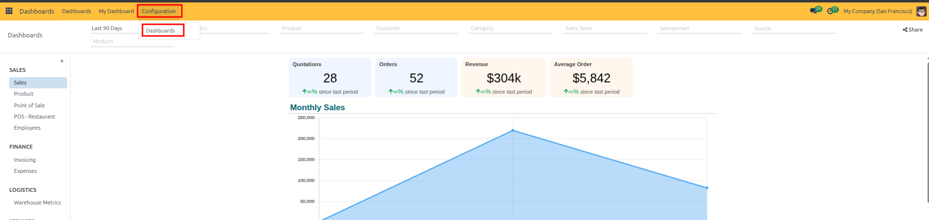
The Dashboards list displays all active category groups (such as Sales, Finance, Logistics, Services, Marketing, Website, and Human Resources).
3. Reordering Groups in the Navigation Sidebar
The top-to-bottom sequence in the list view directly governs the vertical order of categories in the Standard Dashboards navigation sidebar:
Navigate to Dashboards > Configuration > Dashboards.
Click and hold the drag handle (
⠿) at the far left edge of any row.Drag the group row up or down to your desired position and release to save the new order automatically.

4. Creating a New Dashboard Group and Registering Spreadsheets
To create a new departmental category and attach dashboards to it:
In the Dashboards list view, click the + New button at the top left.
In the form view, enter the group title in the top name field (such as
Human Resources).In the Spreadsheets tab, click Add a line to register dashboards within this category:
Name: Enter the title of the individual dashboard (such as
EmployeesorRecruitment).Group: Select a security access group to restrict viewing rights to authorized roles (such as
Human Resources / Officer). Leave empty to allow general access.Company: Select a specific company if this dashboard should only appear in multi-company environments.
Is Published: Check this box to make the dashboard live and visible to end users.
Active: Ensure the record is active.

Click the cloud save icon or navigate back to apply the new category and its spreadsheet dashboards.
5. Editing the Spreadsheet to Add Metrics and Charts
By default, newly registered dashboards initialize with an empty spreadsheet template. To populate the dashboard with metrics, KPI scorecards, and visual charts:
In the Spreadsheets tab of the dashboard group form, locate the dashboard row.
Click the Edit button (pencil icon) on the right side of the row.
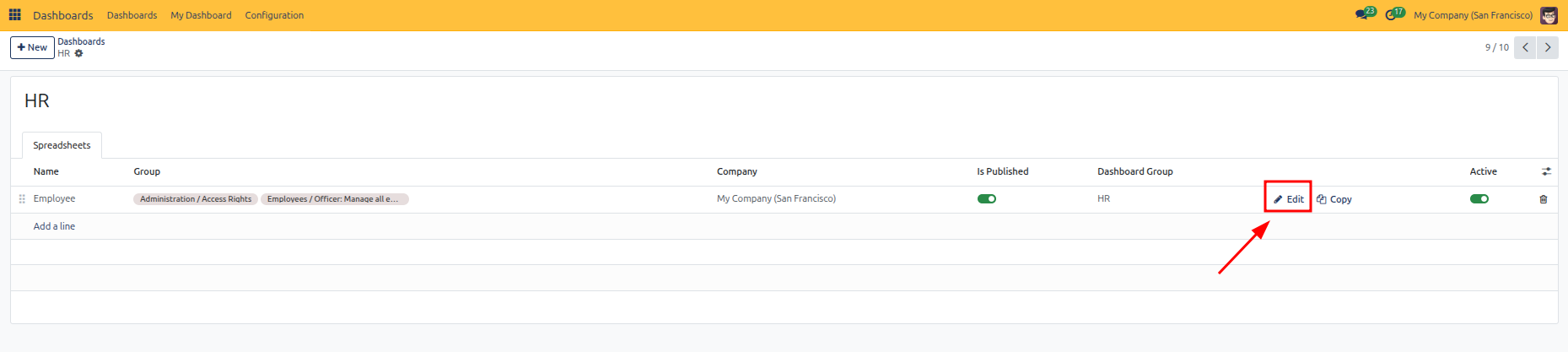
The CURQ Spreadsheet interface opens. Build your dashboard data:
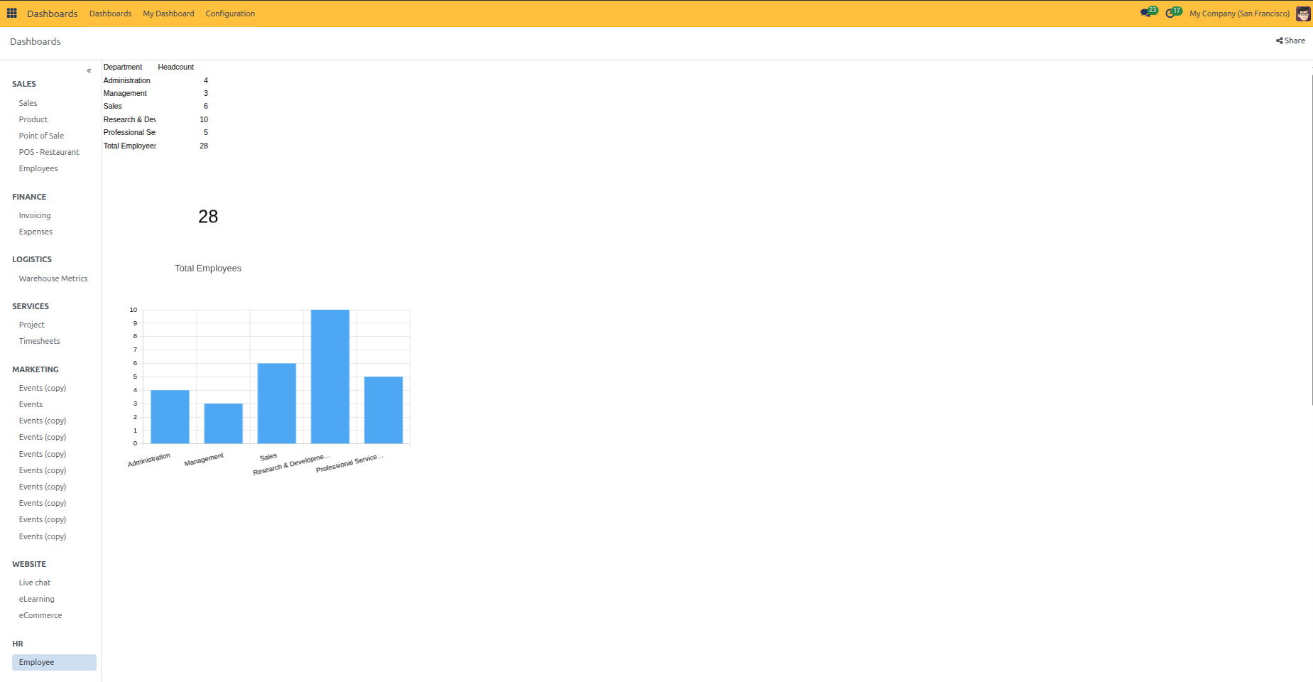
Enter or Import Data: Add metric rows and columns (such as Department categories and Headcount values) directly into the spreadsheet cells. Use standard formulas such as
=SUM(...)to compute totals dynamically.
To turn spreadsheet metrics into visual dashboard widgets:
Click Insert in the spreadsheet menu bar.
Select Chart from the dropdown menu.
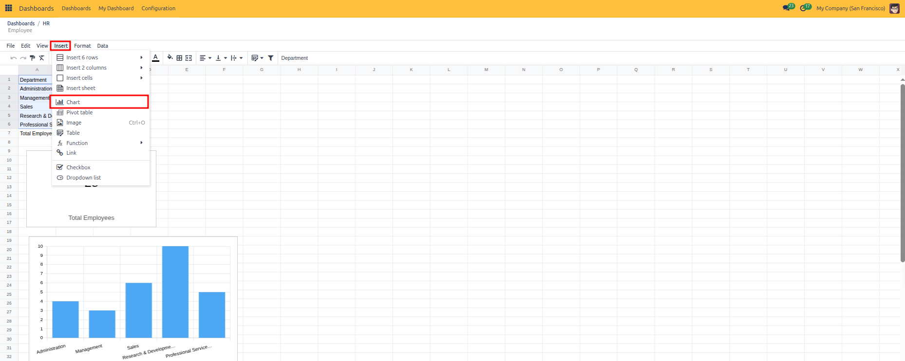
Configure your chart or KPI widgets using the right-hand Chart panel:
Insert KPI Scorecards: Click on a calculated metric cell (such as the total headcount cell). Under Chart type, select Scorecard, set the headline label (such as
Total Employees), and reposition the scorecard on your sheet.Insert Visual Charts: Highlight your data range (such as department names and headcount figures). Under Chart type, select your preferred format (such as Column, Bar, or Pie). Fine-tune your series, category labels, and styling.
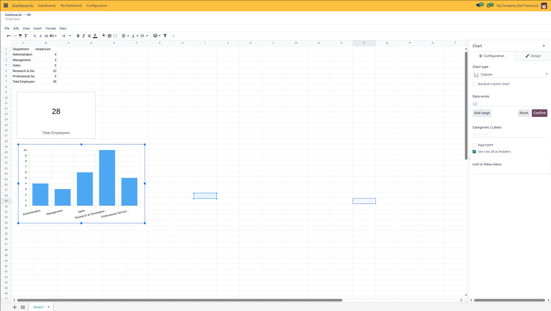
Changes save automatically in the spreadsheet. Click Dashboards in the top navigation bar to exit the editor.
6. Verifying the Live Dashboard and Sidebar Hierarchy
Once published and populated with data, verify how the category and widgets render in Standard Dashboards:
In the top navigation bar, click Dashboards.
In the left navigation sidebar, locate your new group category (such as HR) and click your dashboard (such as Employee).
The dashboard workspace renders your live data table, KPI scorecard, and graphical charts directly on the screen.
Verify Access Restrictions: Log in with an account that lacks the assigned security group privileges. Confirm that restricted dashboards (and empty parent categories) do not appear in the navigation sidebar for unauthorized users.